Wallets
The wallet component allows users to connect their wallets to a Dev Protocol app.
Usage
HTML
<div class="hs-wallet">
<a class="hs-button is-wallet-button">
<i class="hs-button__icon"></i>
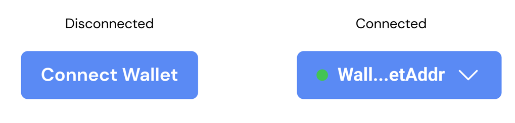
<span class="hs-button__label">Connect Wallet</span>
</a>
<ul class="hs-wallet__details">
<li>Network: ???</li>
</ul>
</div>
SCSS/CSS
@use 'node_modules/@devprotocol/hashi';
@use 'node_modules/@devprotocol/hashi/hs-wallet';

@include hashi.init {
  @include hs-wallet.render();
}
Connected Wallet
Whenever a wallet gets connected, append the .is-connected class to the parent element's class list. This will trigger special styling for the wallet details and the button icon.
<div class="hs-wallet is-connected">
    <a class="hs-button is-wallet-button">
        <i class="hs-button__icon"></i>
        <span class="hs-button__label">[Address Here]</span>
    </a>
    <ul class="hs-wallet__details">
        <li>Network: Polygon</li>
    </ul>
</div>
API
CSS Classes
These are used to structure, extend, and modify the styles of a component on the markup.
Anatomical Classes
These classes make up the elements inside a component.
| Class | Effect |
|---|---|
.hs-wallet | Main/parent wallet class. |
.hs-wallet__details | The wallet details. |
Variant Classes
For information on how to use these classes, click here.
| Class | Effect |
|---|---|
.is-connected | Renders styling if the wallet is connected. |
.is-wallet-button | Indicates the wallet button. |
We also include variant classes for the hs-wallet__details subcomponent. These are mainly for positioning where the details render.
| Class | Effect |
|---|---|
.is-left | Renders the subcomponent aligned to the left |
.is-right | Renders the subcomponent aligned to the right. |
Custom Properties
These are for creating your own component theme classes that you can append to the parent element markup.
| Property | Effect |
|---|---|
--hs-wallet-details-fill | Changes the wallet detail's background color. |
--hs-wallet-details-ink | Changes the wallet detail's text color. |
--hs-wallet-details-border | Changes the wallet detail's border color. |
--hs-wallet-details-radius | Changes the wallet detail's border radius. |
--hs-wallet-details-padding | Changes the wallet detail's padding. |
--hs-wallet-details-shadow | Changes the wallet detail's shadow. |
--hs-wallet-details-family | Changes the wallet detail's font family. |
--hs-wallet-details-size | Changes the wallet detail's font size. |
--hs-wallet-details-weight | Changes the wallet detail's font weight. |
--hs-wallet-details-line-height | Changes the wallet detail's line height. |
Example
.my-select-field-theme {
  --hs-wallet-details-fill: #232323;
  --hs-wallet-details-ink: lime;
  --hs-wallet-details-border: var(--hs-wallet-details-fill);
}
Configuring styles
Here are all the themeable properties for this component. The directions to use these properties are located in the render API.
$fill: 'primary-400' !default;
$fill-hover: 'primary-400' !default;
$fill-focus: 'primary-400' !default;
$fill-active: 'primary-200' !default;
$fill-disabled: 'disabled' !default;

$ink: 'primary-ink' !default;
$ink-disabled: 'disabled-ink' !default;

$border: $fill !default;
$border-hover: $fill-hover !default;
$border-focus: $fill-focus !default;
$border-active: $fill-active !default;
$border-disabled: $fill-disabled !default;

$radius: 'small' !default;
$padding: ('xs' 'md') !default;
Extending styles
If you wish to extend the component styles, the extend() API might come in handy.