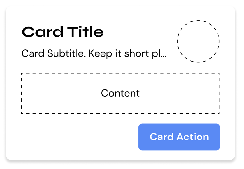
Cards
Cards are a blank surface component that serves short-form/summarized content to the user.
Usage
HTML
<div class="hs-card">
    <header class="hs-card__header">
        <div class="hs-card__mast">
            <h2 class="hs-card__title">CARD TITLE</h2>
            <p class="hs-card__subtitle">Card Subtitle.</p>
        </div>
    </header>
    <main class="hs-card__content">
        Card content :)
    </main>
</div>
SCSS/CSS
@use 'node_modules/@devprotocol/hashi';
@use 'node_modules/@devprotocol/hashi/hs-card';

@include hashi.init {
  @include hs-card.render();
}
Outlined Card
The outlined card style is the default card style.
<div class="hs-card">
    <header class="hs-card__header">
        <div class="hs-card__mast">
            <h2 class="hs-card__title">CARD TITLE</h2>
            <p class="hs-card__subtitle">Card Subtitle.</p>
        </div>
    </header>
    <main class="hs-card__content">
        Card content :)
    </main>
</div>
Filled Card
The filled card style is a style variant of the card component. To enable this style, attach the .is-filled class to the parent element's class list.
The class names inside brackets are only for emphasis, not to be used in the actual implementation.
<div class="hs-card [is-filled]">
    <header class="hs-card__header">
        <div class="hs-card__mast">
            <h2 class="hs-card__title">CARD TITLE</h2>
            <p class="hs-card__subtitle">Card Subtitle.</p>
        </div>
    </header>
    <main class="hs-card__content">
        Card content :)
    </main>
</div>
Card Actions
Card actions is the most bottom section of a card. It contains buttons/hyperlinks that redirect the user to another page, submit an in-card form, or perform any action on click.
<div class="hs-card">
    <header class="hs-card__header">
        <div class="hs-card__mast">
            <h2 class="hs-card__title">CARD TITLE</h2>
            <p class="hs-card__subtitle">Card Subtitle.</p>
        </div>
    </header>
    <main class="hs-card__content">
        Card content :)
    </main>
    <footer class="hs-card__footer">
        <button class="hs-button is-filled" role="button">
            <span class="hs-button__label">Button</span>
        </button>
        <button class="hs-button" role="button">
            <span class="hs-button__label">Button</span>
        </button>
    </footer>
</div>
Card Icons
Card icons provide a way of associating a certain symbol to a card. This is especially useful for token images. The card icon element can only take either an SVG or an image.
<div class="hs-card">
    <header class="hs-card__header">
        <div class="hs-card__mast">
            <h2 class="hs-card__title">CARD TITLE</h2>
            <p class="hs-card__subtitle">Card Subtitle.</p>
        </div>
        <div class="hs-card__icon">
            <!-- Img or SVG -->
        </div>
    </header>
    <main class="hs-card__content">
        Card content :)
    </main>
</div>
Card Media
Card media allows you to have an image that comes along with your card.
<div class="hs-card">
    <section class="hs-card__media">
        <img src="..." alt="Card Media"/>
    </section>
    <header class="hs-card__header">
        <div class="hs-card__mast">
            <h2 class="hs-card__title">CARD TITLE</h2>
            <p class="hs-card__subtitle">Card Subtitle.</p>
        </div>
    </header>
    <main class="hs-card__content">
        Card content :)
    </main>
</div>
API
CSS Classes
These are used to structure, extend, and modify the styles of a component on the markup.
Anatomical Classes
These classes make up the elements inside a component.
| Class | Effect |
|---|---|
.hs-card | Main card class. |
.hs-card__header | The header section of the card component. |
.hs-card__mast | The identification section of the card. |
.hs-card__title | The title of the card. |
.hs-card__subtitle | The subtitle of the card. |
.hs-card__icon | The icon of the card. |
.hs-card__media | The media of the card. |
.hs-card__content | The content section of the card. |
.hs-card__actions | Here is where you put all the buttons for the card. |
Variant Classes
For information on how to use these classes, click here.
| Class | Effect |
|---|---|
.is-raised | Renders the card in its raised style. |
Custom Properties
These are for creating your own component theme classes that you can append to the parent element markup.
| Property | Effect |
|---|---|
--hs-card-fill | Changes the card's background color. |
--hs-card-ink | Changes the card's text color. |
--hs-card-border | Changes the card's border color. |
--hs-card-radius | Changes the card's border radius. |
--hs-card-padding | Changes the card's padding. |
--hs-card-section-gap | Changes the card's section's gaps. |
--hs-card-header-gap | Changes the card's header gap. |
--hs-card-footer-gap | Changes the card's footer gap. |
--hs-card-weight | Changes the card's border color. |
--hs-card-ink | Changes the card's content color. |
--hs-card-family | Changes the card content's family. |
--hs-card-size | Changes the card content's size. |
--hs-card-weight | Changes the card content's weight. |
--hs-card-line-height | Changes the card content's line-height. |
--hs-card-title-family | Changes the card title's family. |
--hs-card-title-size | Changes the card title's size. |
--hs-card-title-weight | Changes the card title's weight. |
--hs-card-title-line-height | Changes the card title's line-height. |
--hs-card-subtitle-family | Changes the card subtitle's family. |
--hs-card-subtitle-size | Changes the card subtitle's size. |
--hs-card-subtitle-weight | Changes the card subtitle's weight. |
--hs-card-subtitle-line-height | Changes the card subtitle's line-height. |
--hs-card-icon-size | Changes the card's icon size. |
--hs-card-media-height | Changes the card's media height. |
Example
.my-card-theme {
  --hs-card-fill: #232323;
  --hs-card-ink: lime;
  --hs-card-border: var(--hs-button-fill);

  &:hover {
    --hs-card-fill: #353535;
  }

  &:active {
    --hs-card-fill: #535353;
  }
}
Configuring styles
Here are all the themeable properties for this component. The directions to use these properties are located in the render API.
$fill: 'surface-200' !default;
$ink: 'surface-ink' !default;
$border: 'primary-400' !default;
$tone: 200 !default;

$radius: 'medium' !default;
$padding: 'md' !default;

$title-typography: 'subtitle' !default;
$subtitle-typography: 'body' !default;
$content-typography: 'body' !default;

$icon-size: 66px !default;
$media-height: 120px !default;

$section-gap: 'md' !default;
$header-gap: 'md' !default;
$footer-gap: 'sm' !default;
Extending styles
If you wish to extend the component styles, the extend() API might come in handy.