Profiles
Profiles show information about someone. May it be the user's, a fellow user's, or a person from the team.
Usage
HTML
<div class="hs-profile">
    <div class="hs-profile__img">
        <img src="https://devprotocol.xyz/assets/logo.png" alt="Profile Image">
    </div>
    <div class="hs-profile__info">
        <h3 class="hs-profile__name">Name of person</h3>
        <p class="hs-profile__role">Role of person</p>
        <p class="hs-profile__description">Lorem ipsum dolor sit amet, consectetur adipisicing elit. Adipisci, quas.</p>
    </div>
</div>
SCSS/CSS
@use 'node_modules/@devprotocol/hashi';
@use 'node_modules/@devprotocol/hashi/hs-profile';

@include hashi.init {
  @include hs-profile.render();
}
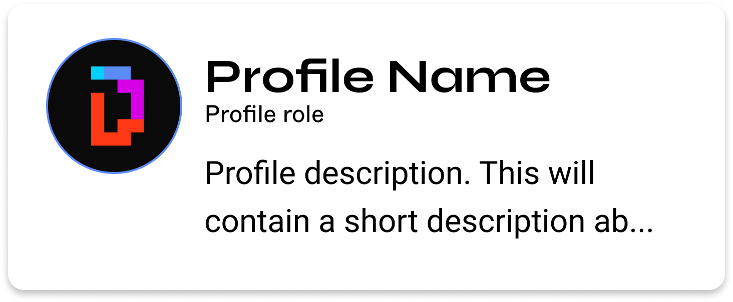
Outlined Profile
The outlined profile style is the default profile style.
<div class="hs-profile">
    <div class="hs-profile__img">
        <img src="https://devprotocol.xyz/assets/logo.png" alt="Profile Image">
    </div>
    <div class="hs-profile__info">
        <h3 class="hs-profile__name">Name of person</h3>
        <p class="hs-profile__role">Role of person</p>
        <p class="hs-profile__description">Lorem ipsum dolor sit amet, consectetur adipisicing elit. Adipisci, quas.</p>
    </div>
</div>
Filled Profile
The filled profile style is a style variant of the profile component. To enable this style, attach the .is-filled class to the parent element's class list.
The class names inside brackets are only for emphasis, not to be used in the actual implementation.
<div class="hs-profile [is-filled]">
    <div class="hs-profile__img">
        <img src="https://devprotocol.xyz/assets/logo.png" alt="Profile Image">
    </div>
    <div class="hs-profile__info">
        <h3 class="hs-profile__name">Name of person</h3>
        <p class="hs-profile__role">Role of person</p>
        <p class="hs-profile__description">Lorem ipsum dolor sit amet, consectetur adipisicing elit. Adipisci, quas.</p>
    </div>
</div>
API
CSS Classes
These are used to extend and modify the styles of a component on the markup.
Anatomical Classes
These classes make up the elements inside a component.
| Class | Effect |
|---|---|
.hs-profile | Main profile component class. |
.hs-profile__img | The component's image class. |
.hs-profile__info | A wrapper class for the profile information. |
.hs-profile__name | The name of the person in the profile. |
.hs-profile__role | The role of the person in the profile. |
.hs-profile__description | A short description about the person in the profile. |
Variant Classes
For information on how to use these classes, click here.
| Class | Effect |
|---|---|
.is-raised | Renders the profile in its raised style. |
Custom Properties
These are for creating your own component theme classes that you can append to the parent element markup.
| Property | Effect |
|---|---|
--hs-profile-fill | Changes the profile's background color. |
--hs-profile-ink | Changes the profile's text color. |
--hs-profile-border | Changes the profile's border color. |
--hs-profile-radius | Changes the profile's border radius. |
--hs-profile-padding | Changes the profile's padding. |
--hs-profile-width | Changes the profile's width. |
--hs-profile-gap | Changes the profile's gap. |
--hs-profile-profile-img-size | Changes the profile image's size. |
--hs-profile-profile-img-border | Changes the profile image's border color. |
--hs-profile-profile-[name/description/role]-family | Changes the profile name, description, and role font family. |
--hs-profile-profile-[name/description/role]-size | Changes the profile name, description, and role font size. |
--hs-profile-profile-[name/description/role]-weight | Changes the profile name, description, and role font weight. |
--hs-profile-profile-[name/description/role]-line-height | Changes the profile name, description, and role line-height. |
Example
.my-profile-theme {
  --hs-profile-ink: lime;
}
Configuring styles
Here are all the themeable properties for this component. The directions to use these properties are located in the render API.
$fill: 'surface-200' !default;
$ink: 'surface-ink' !default;
$border: 'primary-400' !default;

$radius: 'sm' !default;
$padding: 'md' !default;

$gap: 'md' !default;
$img-size: 66px !default;

$name-typography: 'subtitle' !default;
$role-typography: 'small' !default;
$description-typography: 'body' !default;
Extending styles
If you wish to extend the component styles, the extend() API might come in handy.