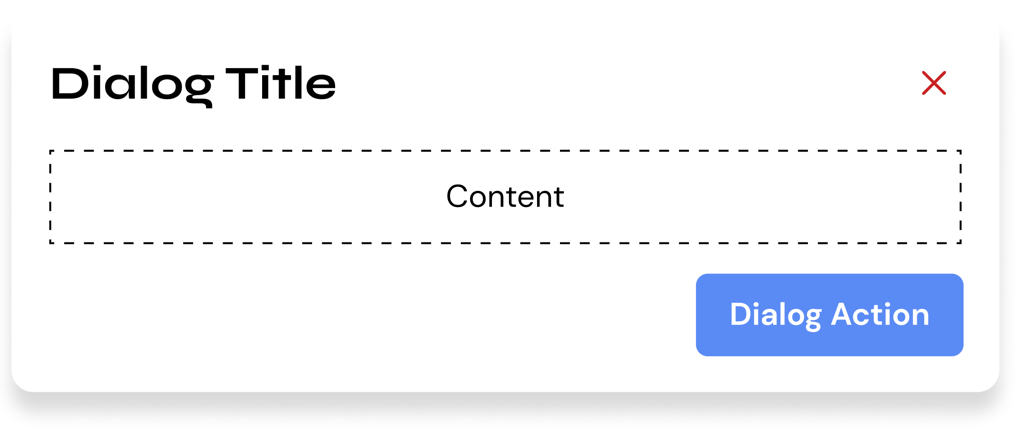
Dialogs
Dialogs let the user see important information, and/or perform an action that requires attention.
Usage
HTML
<div class="hs-dialog">
    <div class="hs-dialog__container">
        <header class="hs-dialog__header">
            <h2>Dialog Header</h2>
            <button class="hs-button hs-dialog__close-button is-icon-only is-danger">
                <i class="hs-button__icon">
                    <svg xmlns="http://www.w3.org/2000/svg" viewBox="0 0 320 512">
                        <path d="M310.6 361.4c12.5 12.5 12.5 32.75 0 45.25C304.4 412.9 296.2 416 288 416s-16.38-3.125-22.62-9.375L160 301.3L54.63 406.6C48.38 412.9 40.19 416 32 416S15.63 412.9 9.375 406.6c-12.5-12.5-12.5-32.75 0-45.25l105.4-105.4L9.375 150.6c-12.5-12.5-12.5-32.75 0-45.25s32.75-12.5 45.25 0L160 210.8l105.4-105.4c12.5-12.5 32.75-12.5 45.25 0s12.5 32.75 0 45.25l-105.4 105.4L310.6 361.4z" />
                    </svg>
                </i>
            </button>
        </header>
        <section class="hs-dialog__content">
            <p>Lorem ipsum dolor sit amet, consectetur adipisicing elit. Dolorem esse expedita incidunt inventore
                quibusdam unde? Accusantium dolorum eligendi esse minima quo saepe sapiente tempore. Amet error facere
                porro repellendus voluptates?</p>
        </section>
    </div>
</div>
HTML Caveats
There's a few things you need to remember when using Hashi dialogs. If you're planning to use it with the built-in vanilla Javascript/Typescript API, you need to assign the component to an identifier.
<div class="hs-dialog" id="my-dialog-identifier">
    <!-- ... -->
</div>
This way you can reference it with the Typescript API.
const myDialog = new HSDialog('#my-dialog-identifier');
SCSS
@use 'node_modules/@devprotocol/hashi';
@use 'node_modules/@devprotocol/hashi/hs-dialog';

@include hashi.init {
  @include hs-dialog.render();
}
Typescript
import HSDialog from '@devprotocol/hashi/hs-dialog';

const dialog = new HSDialog('#my-dialog-identifier');
dialog.open();
Dialog Contents
Dialog contents can be anything. It can range from plain text, to Hashi components. Here are a few use cases:
Website Settings Dialog
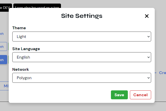
This dialog use case allows users to modify parts, features, and/or current constants of the website. These settings may include light/dark mode toggles, language settings, and network settings.
<div class="hs-dialog">
    <div class="hs-dialog__container">
        <header class="hs-dialog__header">
            <h2>Site Settings</h2>
            <button class="hs-button hs-dialog__close-button is-icon-only is-danger">
                <i class="hs-button__icon">
                    <svg xmlns="http://www.w3.org/2000/svg" viewBox="0 0 320 512"><path d="M310.6 361.4c12.5 12.5 12.5 32.75 0 45.25C304.4 412.9 296.2 416 288 416s-16.38-3.125-22.62-9.375L160 301.3L54.63 406.6C48.38 412.9 40.19 416 32 416S15.63 412.9 9.375 406.6c-12.5-12.5-12.5-32.75 0-45.25l105.4-105.4L9.375 150.6c-12.5-12.5-12.5-32.75 0-45.25s32.75-12.5 45.25 0L160 210.8l105.4-105.4c12.5-12.5 32.75-12.5 45.25 0s12.5 32.75 0 45.25l-105.4 105.4L310.6 361.4z"/></svg>
                </i>
            </button>
        </header>
        <section class="hs-dialog__content">
            <label class="hs-select-field">
                <span class="hs-select-field__label">Theme</span>
                <select class="hs-select-field__input">
                    <option>Light</option>
                    <option>Dark</option>
                </select>
            </label>
            <label class="hs-select-field">
                <span class="hs-select-field__label">Site Language</span>
                <select class="hs-select-field__input">
                    <option>English</option>
                    <option>日本語</option>
                    <option>Português</option>
                </select>
            </label>
            <label class="hs-select-field">
                <span class="hs-select-field__label">Network</span>
                <select class="hs-select-field__input">
                    <option>Polygon</option>
                    <option>Ethereum</option>
                    <option>Arbitrium</option>
                </select>
            </label>
        </section>
        <footer class="hs-dialog__footer is-content-right">
            <button class="hs-button is-filled is-success">
                <span class="hs-button__label">Save</span>
            </button>
            <button class="hs-button is-outlined is-danger">
                <span class="hs-button__label">Cancel</span>
            </button>
        </footer>
    </div>
</div>
Project Staking Form
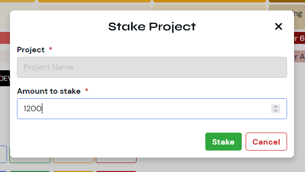
This dialog use case allows users to stake their tokens to projects to earn rewards.
<dialog class="hs-dialog">
    <div class="hs-dialog__container">
        <header class="hs-dialog__header">
            <h2>Stake Project</h2>
            <button class="hs-button hs-dialog__close-button is-icon-only is-danger">
                <i class="hs-button__icon">
                    <svg xmlns="http://www.w3.org/2000/svg" viewBox="0 0 320 512"><path d="M310.6 361.4c12.5 12.5 12.5 32.75 0 45.25C304.4 412.9 296.2 416 288 416s-16.38-3.125-22.62-9.375L160 301.3L54.63 406.6C48.38 412.9 40.19 416 32 416S15.63 412.9 9.375 406.6c-12.5-12.5-12.5-32.75 0-45.25l105.4-105.4L9.375 150.6c-12.5-12.5-12.5-32.75 0-45.25s32.75-12.5 45.25 0L160 210.8l105.4-105.4c12.5-12.5 32.75-12.5 45.25 0s12.5 32.75 0 45.25l-105.4 105.4L310.6 361.4z"/></svg>
                </i>
            </button>
        </header>
        <section class="hs-dialog__content">
            <label class="hs-form-field is-required">
                <span class="hs-form-field__label">Project</span>
                <input class="hs-form-field__input" type="text" placeholder="Project Name" readonly>
            </label>
            <label class="hs-form-field is-required">
                <span class="hs-form-field__label">Amount to stake</span>
                <input class="hs-form-field__input" type="number" placeholder="0">
            </label>
        </section>
        <footer class="hs-dialog__footer is-content-right">
            <button class="hs-button is-filled is-success">
                <span class="hs-button__label">Stake</span>
            </button>
            <button class="hs-button is-outlined is-danger">
                <span class="hs-button__label">Cancel</span>
            </button>
        </footer>
    </div>
</dialog>
<dialog> supportAs of right now, the current version of Hashi only partially supports the native <dialog> element. In future versions we will fully migrate to the said implementation.
API
CSS Classes
These are used to extend and modify the styles of a component on the markup.
Anatomical Classes
These classes make up the elements inside a component.
| Class | Effect |
|---|---|
.hs-dialog | Main dialog class. |
.hs-dialog__header | Class for the dialog header. |
.hs-dialog__footer | Class for the dialog footer. |
.hs-dialog__close-button | Class for the dialog close button. |
Variant Classes
For information on how to use these classes, click here.
| Class | Effect |
|---|---|
.is-open | Renders the component in its opened state. |
.is-content-left | Renders the dialog footer in with its content aligned on the left. |
.is-content-center | Renders the dialog footer in with its content aligned on the center. |
.is-content-right | Renders the dialog footer in with its content aligned on the right. |
Custom Properties
These are for creating your own component theme classes that you can append to the parent element markup.
| Property | Effect |
|---|---|
--hs-dialog-fill | Changes the dialog's background color. |
--hs-dialog-ink | Changes the dialog's text color. |
--hs-dialog-border | Changes the dialog's border color. |
--hs-dialog-radius | Changes the dialog's border radius. |
--hs-dialog-gap | Changes the dialog footer's gap property. |
--hs-dialog-padding | Changes the dialog's padding. |
--hs-dialog-header-ink | Changes the dialog's header color. |
--hs-dialog-header-size | Changes the dialog's header size. |
--hs-dialog-header-weight | Changes the dialog's header weight. |
--hs-dialog-header-shadow | Changes the dialog's header shadow. |
Example
.my-button-theme {
  --hs-dialog-fill: #232323;
  --hs-dialog-ink: lime;
  --hs-dialog-border: var(--hs-dialog-fill);

  &:hover {
    --hs-dialog-fill: #353535;
  }

  &:active {
    --hs-dialog-fill: #535353;
  }
}
Configuring styles
Here are all the themeable properties for this component. The directions to use these properties are located in the render API.
$fill: 'surface-200' !default;
$ink: 'surface-ink' !default;
$border: $fill !default;

$width: 570px !default;
$radius: 'medium' !default;
$padding: 'md' !default;

$header-typography: 'subtitle' !default;
Extending styles
If you wish to extend the component styles, the extend() API might come in handy.
Typescript Properties
| Property | Description |
|---|---|
isOpen: boolean | Returns if instance of a dialog is open. |
isClosed: boolean | Returns if instance of a dialog is closed. |
Typescript Methods
| Method | Description |
|---|---|
open() => void | Opens the dialog component. |
close() => void | Closes the dialog component. |