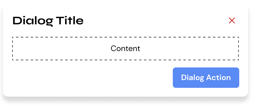
Cards
Card Header
The card header contains all the titular information of the card. It serves as a hook for the user. It should display necessary (but not deep) information.
The order of information is as follows:
- Card Title - A simple and short headline.
- Card Subtitle - Short additional, but still relevant information.
- Card Image (Optional) - Main media for the card.
- Card Icon (Optional) - Small media for the card.
Card Content
The card is a blank surface component, technically you can put anything in there. However, all the content inside the card should not overflow the container.
You cannot also put too many contents inside a card. We generally put the limit at about 2 components (regardless of size).
Card Actions
Card actions allows a user to perform an action related to the card. Card actions use the Hashi button component.
We have certain guidelines on how to use card actions. First, all actions must be unique in terms of priority, meaning you can't have two buttons that have the top priority. Button priority is indicated through its style. Button priority information and guidelines can be found in the button variants section of the button documentation.
Second, the priority hierarchy direction flows from left to right (left being the most prioritized, right being the least prioritized)
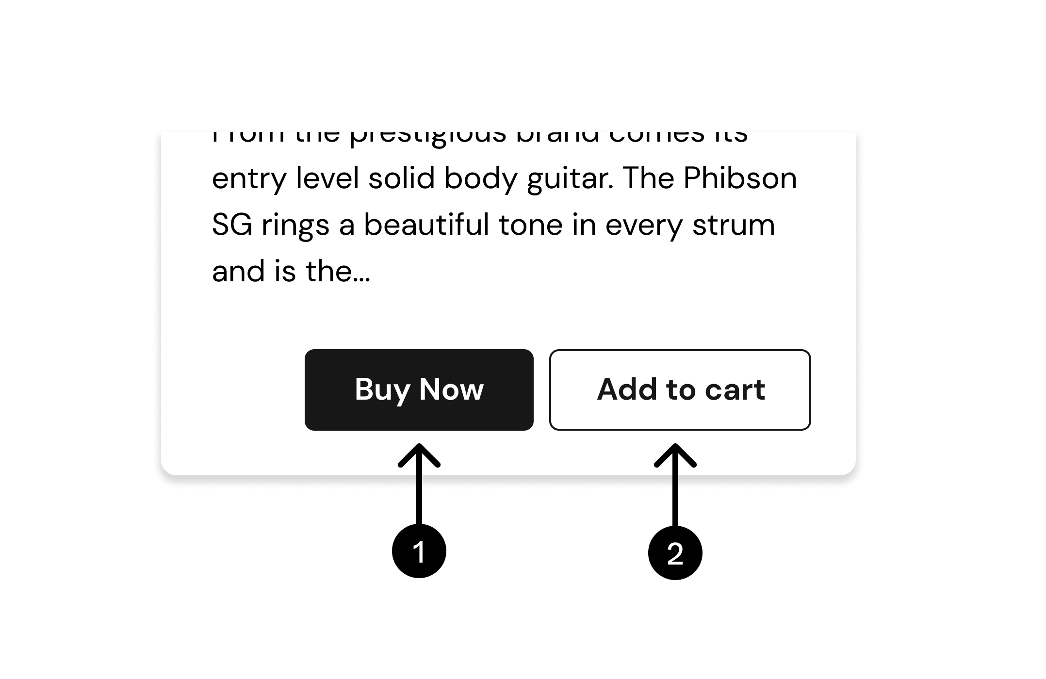
- As you can see, the primary (top priority) action in this context is on the left side
- While the secondary (least priority) action is on the right.