Color Theming
Hashi's guidelines for applying colors on a global scope.
Main Color Properties
Hashi's theming system has three main color properties: Primary, Accent, and Background.
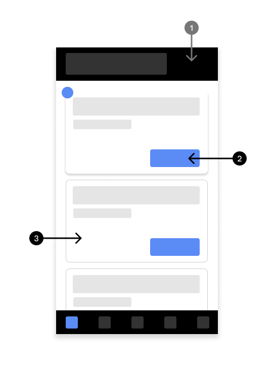
1. Primary Color
This color defines the emphasized surfaces in an interface. These consist of headers, appbars, navbars, drawers, hero sections, etc. The primary color property takes one primitive color token, or one escape hatch color preset each for both light and dark mode.
2. Accent Color
This color defines very emphasized, interact-able, and eye-catching portions in an interface. Its purpose is to highlight a portion of the interface that needs attention. These usually are form actions, page indicators, quantity indicators, notification count, alerts, etc.
These consist of buttons and button groups, form field and select field accent colors, badges, tags, etc. The accent color property takes one primitive color token, or one escape hatch color preset each for both light and dark mode.
3. Surface Color
The background color defines the non-emphasized surfaces in an interface. The neutral of the bunch. Things like cards, modals, dialogs, profiles, drawers, etc. The background color property only takes one primitive color token, or one escape hatch color preset each for both light and dark mode.
Typography & Iconography Colors
"Ink" Colors
"Ink" colors are the colors applied to typography and iconography in an interface. These colors usually greatly contrast their background/surface color counterparts for maximum legibility, and to avoid visual blurs.
Primitive color tokens have pre-made "ink" colors, so you don't have to manually get them. Unless you wish to have it a different ink color.